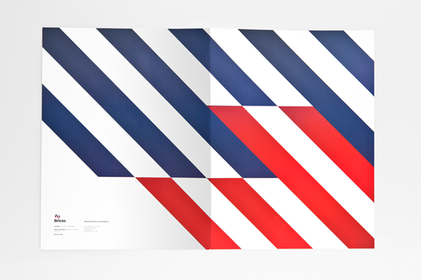
Anagrama gave this hardware store a timeless identity with a completely different icon than any of its competitors, with clean typography and an pattern that can be easily applied to any object.
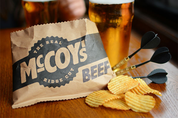
McCoy’s are known as “Man Crisps”, so BTL Brands gave them the manliest chips bag as they simply designed it in landscape format, instead of portait like every other bag. Now even the manliest of men with the biggest hands can fit them into the bag!
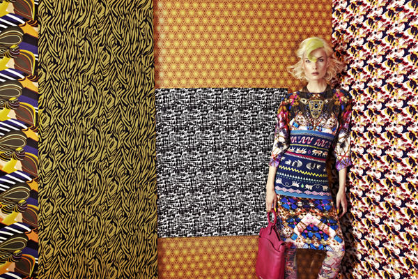
In this series called ‘Patchwork’, Madame Peripetie experiments with fabrics and patterns whilst infusing high-fashion elements with abstract ideas, creating an eccentric escapade of colour and texture.
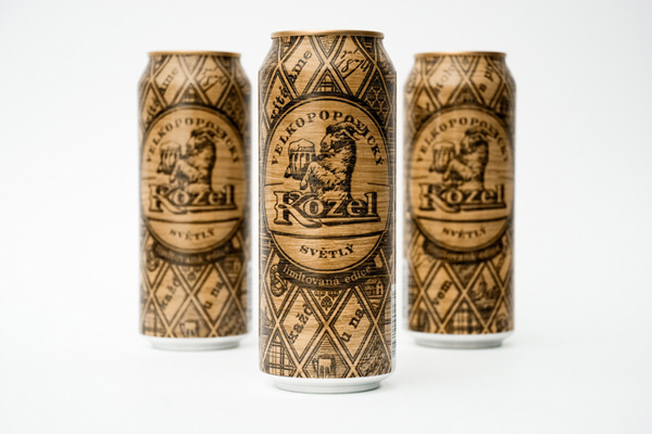
The wood-burn design of the limited edition of Velkopopovicky Kozel beer reflects the ancient traditions as well as the mastership of the Czech brewers. Also, the brewery offers gifts to everyone who will unravel the special message that is encoded on the can.
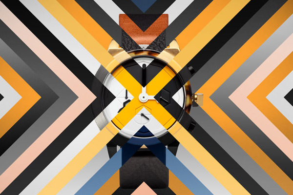
The AÃRK Collective from Melbourne, Australia, made these stylish watches. The art direction is impressive, and the attention to every detail honours the craftsmanship. Form and function, minimalist and cool.
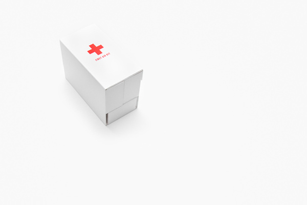
Gabriele Meldaikyte from London, combined pretty with functional in this one-handed usage first aid kit design. It’s easy to use, easy to understand. Meldaikyte believes that the design of normal first aid kits do not “address that they are often used by someone who has no medical training”.
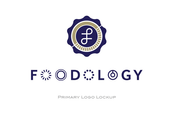
Restaurant branding for Foodology, by Singapore based design form Somewhere Else. The attention to detail is remarkable and the resulting overall execution is an effective one.
Branding for an Icelandic micro-brewery called Þorsteinn (Thorsteinn), which loosely translates into ‘thirsty one’. The concept is to have one type of beer with different bottle designs which’d change annually.
By Þorleifur Gunnar Gíslason, Hlynur Ingólfsson and Geir Olafsson.