The Nike+ Challenge Men vs. Women is all about beating the other gender on the running track. They took this spirit to the Web by connecting a Nike+ banner on a website for women with one on a website for men. via JvM/Neckar
Author: dev
Categories
SANYO ADVERTISING
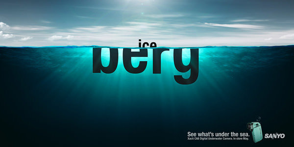
Realy cool typographic solution by Saatchi & Saatchi New Zealand have created this campaign for Sanyo’s underwater camera. via fubiz
Categories
OFFF by Rob Chiu and Chris Hewitt
After the amazing job they did for OFFF New York, Rob Chiu and Chris Hewitt made it again and came with this Open Titles for Lisbon’08, a truly lovely surprise!
Categories
Hello Monday
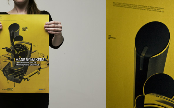

Hello Monday “is a Flash-revolutionizing, identity-building, talent-cultivating…” blablabla. I have the biggest… But there are good works!
Categories
Monkey Pee Monkey Poo
The whole video was shot on high-speed RED one, overexposed and then channel inverted. Video directed by Daniel Bjugård & David Giese. More about Daniel Savio on r.fm
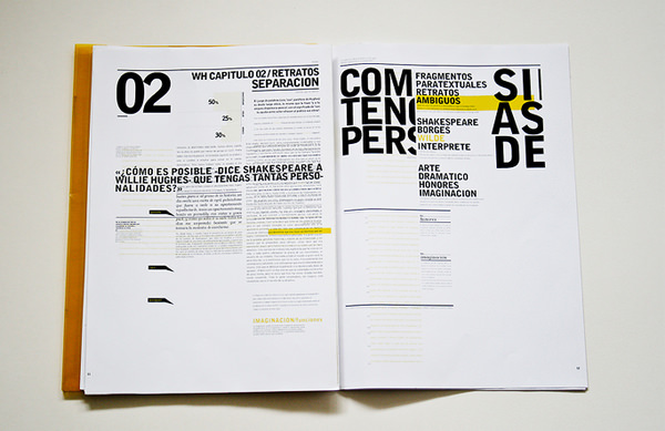
Really great typography! more on behance! I love this fucking big types and the technical style.
Categories
Lacoste Advertising
Lacoste launches its new Lacoste Red! collection online and revamps its style with the help of Kris Moyes and Yuksek.

I love the big types. Good work Greig! More on Behance
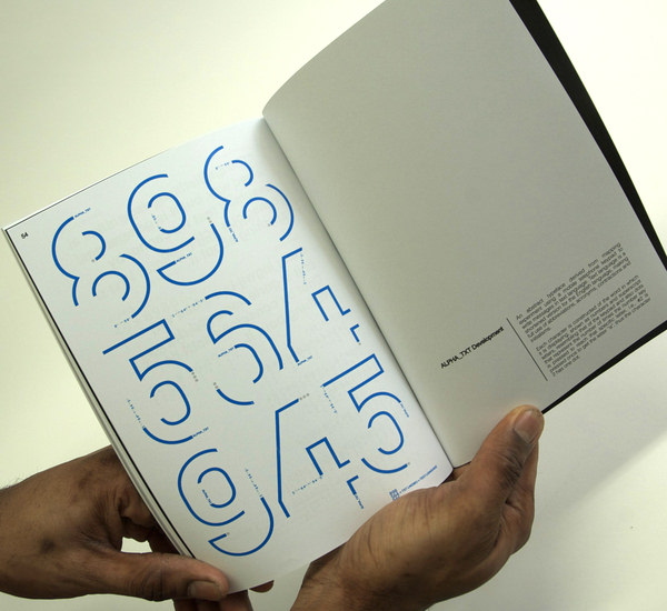
ALPHA_TXT, has developed into Typeface that represents the evolution of the English language.
It reflects the way that we communicate due to our yes, yes, now, now global society. More on Behance
It reflects the way that we communicate due to our yes, yes, now, now global society. More on Behance


